

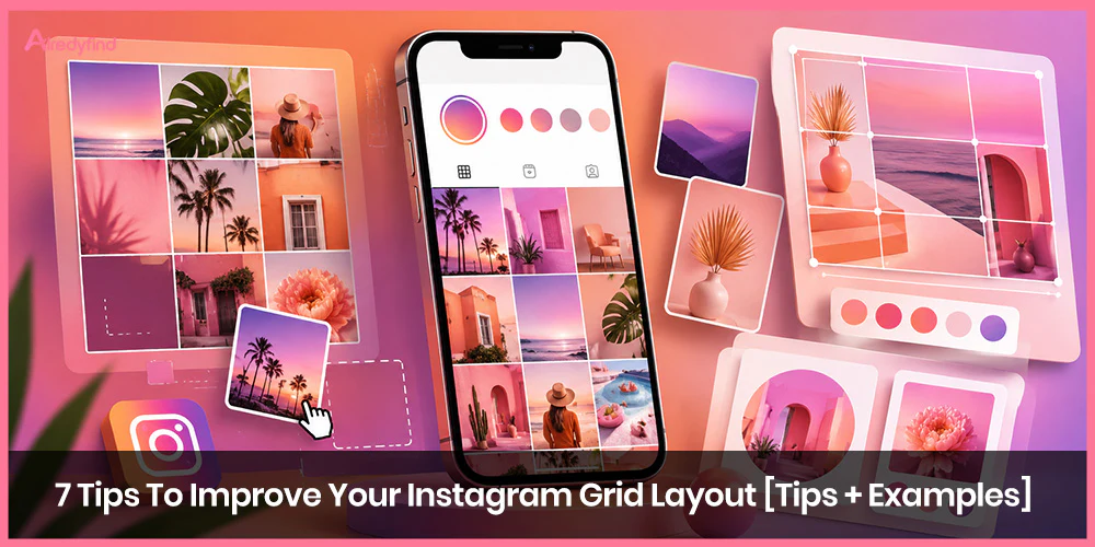
Your Instagram grid is the first thing most people see when they land on your profile. It’s not just a collection of posts—it’s a visual storefront that signals who you are, what you stand for, and whether someone should hit “Follow.” A scattered, random-looking feed can make even great content feel forgettable. A thoughtful grid layout, on the other hand, creates that instant “I need to see more of this” reaction.
Whether you’re building a personal brand, running a business account, or just want your profile to feel intentional, improving your Instagram grid is one of the highest-leverage moves you can make. The good news? You don’t need to overhaul everything overnight. Small, consistent choices compound into a feed that looks polished and feels cohesive.
Here are seven practical tips—backed by what actually works on profiles that convert profile visitors into followers—along with real-world examples and ways to apply them.
Commit to a Consistent Color Palette (or Tone)
This is the foundation of most strong Instagram aesthetics. Pick a limited set of colors or a specific mood (warm neutrals, cool blues and greens, high-contrast black-and-white with one accent, soft pastels) and lean into it across nearly every post.
When colors or tones repeat, the eye reads the whole grid as one intentional piece rather than a jumble of unrelated photos. Brands that do this well often use the same editing style or Lightroom preset so even different subjects feel related.
A jewelry account might stay in cool silvers and soft whites. A lifestyle creator focused on travel could stick to sandy beiges, muted teals, and golden-hour warmth. The key is restraint: two to four dominant colors (or one strong tonal family) is usually enough. You can still introduce variety through composition and subject matter.
This approach directly supports the broader goal of creating a cohesive Instagram feed—something searchers constantly look up because it makes profiles feel professional and memorable at a glance.
Try a Checkerboard Pattern
Alternate two distinct types of posts: photo → graphic (or quote/text post) → photo → graphic, and so on. The resulting checkerboard effect is simple to maintain and immediately looks deliberate.
Many accounts alternate lifestyle or product photos with bold text-on-solid-background graphics, or close-ups with wider environmental shots. The contrast creates visual rhythm without requiring advanced design skills. Keep the graphics consistent in font, background color, or style so the pattern stays clear.
This layout works especially well if you need to mix educational content, promotions, and personal posts. It prevents the feed from feeling too samey while still reading as organized.
Design Row by Row or Column by Column
Instead of treating every post as a standalone, plan in groups of three. For a row-by-row approach, make each horizontal row share a theme, color, or content type (three similar product shots, three quote graphics, three behind-the-scenes moments). For columns, repeat the same style of post in the left, middle, or right position as you scroll down.
Some creators even run a diagonal version by placing a consistent element (like a text post) every fourth image. The effect is subtle but powerful—it guides the eye and makes the grid feel structured rather than random.
This method is excellent for storytelling. One row can introduce a product launch, the next can show customer results, and the following can share tips. Viewers who land on your profile get a clearer sense of your content pillars right away.
Let Typography and Text Graphics Own Parts of the Grid
Text-heavy posts, when designed consistently, become a strong visual signature. Use the same one or two fonts, similar layout templates, and a limited color set for any graphic or quote posts. Mixed with photos, they create the balanced, magazine-like feel that many high-performing educational and brand accounts rely on.
The individual posts still need to work on their own (clear headlines, readable text even at thumbnail size), but together they reinforce brand recognition. Accounts that lean into this often see better engagement on the text posts themselves because the design signals value or personality before someone even taps.
Experiment with Color Transitions or a Soft “Rainbow” Flow
Rather than locking into one palette forever, gradually shift colors across rows. Spend a few posts in deep blues and greens, then ease into warmer tones, then soft neutrals. The transition doesn’t have to be a strict rainbow—subtle shifts still create movement and keep the grid interesting over time.
This works particularly well for accounts that post frequently or want seasonal refreshes without starting from scratch. It keeps the feed feeling dynamic while still cohesive.
Lean Into Your Actual Brand Colors
If you already have brand colors, put them to work on the grid. Make sure the primary color (or a close variation) appears in almost every post—whether as a background, accent object, text color, or product detail. Secondary colors can support it, but the hero color becomes the thread that ties everything together.
This is slightly different from a general aesthetic palette because it prioritizes recognition. When someone sees your grid, they should immediately associate it with your brand, not just “nice photos.”
Create Occasional Puzzle or Connected-Image Moments
For launches, announcements, or special campaigns, design a set of posts that visually connect across the grid borders. A single wide image split into three or nine tiles, or a continuous scene that flows from one post to the next, creates a memorable “wow” moment when viewed on the profile.
These are harder to maintain day-to-day (and each individual post still needs to make sense alone), so most accounts use them sparingly. When done well, they stop the scroll and make the grid feel like a deliberate art piece rather than a content calendar.
How to Actually Plan and Maintain Your Grid
None of these layouts happen by accident. The accounts with the cleanest grids plan ahead. Use a visual planner (Preview, Planoly, Later, or similar tools) to drag and drop upcoming posts and see how they sit next to each other before anything goes live. Aim to plan at least nine posts at a time so you can see a full grid view.
Keep quality high—sharp, well-lit images and consistent editing matter more than perfect symmetry. Mix content types (photos, carousels, Reels covers) so the grid doesn’t feel static, but make sure the overall visual language stays unified. And remember that Instagram’s current grid previews lean more vertical (around 3:4 or 4:5 ratios), so design with that in mind and keep important elements centered.
Balance is key. A feed that is too rigidly perfect can feel like an ad. One that is completely chaotic makes it hard for visitors to understand what you offer. The sweet spot is intentional variety within a clear visual system.
FAQ
It still matters, especially for first impressions and for visual or lifestyle niches. Authenticity has become more valued than rigid perfection, but a grid that feels random or low-effort makes it harder for people to decide to follow. Clear, engaging post previews and some visual consistency help visitors quickly understand your content and want more of it.
Start with a consistent color palette or a simple checkerboard (photo alternating with a graphic). Both are forgiving and immediately improve the look of a profile without complex planning.
They help a lot. Free or freemium tools let you preview how posts will look together, rearrange them, and schedule. Without a planner it’s easy to post something that breaks the overall flow.
There’s no strict rule. Many accounts stick with one core approach for months and only shift for seasons, campaigns, or brand refreshes. Major overhauls can temporarily disrupt recognition, so evolve gradually when possible.
Yes—and you should. Design strong cover images or first slides so they fit the overall aesthetic. The grid is what people see first; the content formats are what keep them engaged once they start tapping.

